Enhancing Awareness and Insight through Innovative Dashboards – A Case Study
Air quality stands at the forefront of global concerns, intertwined with the intricate web of climate change, public health, and environmental sustainability. At Appy Insights, we recognize the pivotal role of accessible data visualization in fostering understanding and action. That’s why we’ve developed dynamic dashboards aimed at illuminating air quality metrics in a visually engaging manner.
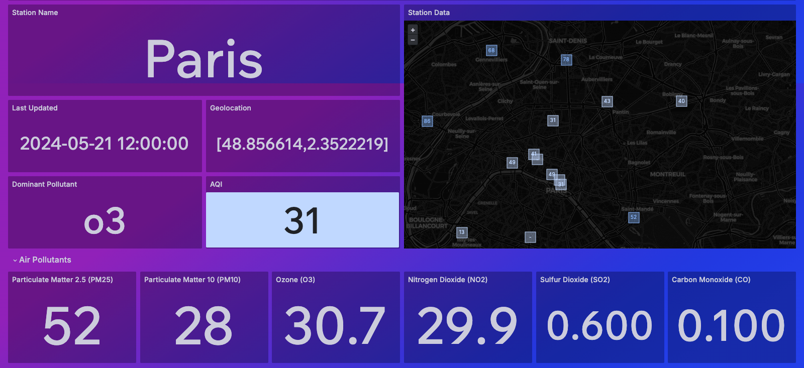
1) Air Quality API: Unveiling Real-Time Insights
Data sourced from: World’s Air Pollution: Real-time Air Quality Index (waqi.info)
The Air Quality API Dashboard harnesses live data to deliver up-to-the-minute air quality metrics for specific regions. Featuring an intuitive search functionality, users can seamlessly explore air quality indices (AQI) across different locales. The interactive map provides a snapshot of AQI values, allowing for deeper dives with just a click. Detailed station information, including the latest update timestamp, geolocation data, dominant pollutants, and insightful forecasts for the next five days, empowers users with comprehensive insights.

2) Mumbai Air Quality Dashboard: A Case Study in Visualization
Data sourced from: Air Quality Index(AQI) data of Mumbai (kaggle.com)
Exploring the bustling metropolis of Mumbai, our dashboard offers a granular examination of air quality dynamics. Highlighting AQI trends alongside a state timeline for particulate matter 2.5 (PM2.5), users gain a nuanced understanding of pollution patterns over time. Comparative analyses with temperature and relative humidity enrich the narrative, while detailed maps pinpoint pollution hotspots across the city. In-depth metrics on Nitrogen Dioxide (NO2) levels, including averages, minimums, maximums, and standard deviations, facilitate holistic assessments. Moreover, correlations between air quality parameters and temperature unveil valuable insights into environmental interdependencies.
3) Exploring Seasonal Variations: Unraveling the Impact of Seasons
Data sourced from: Air Quality Index(AQI) data of Mumbai (kaggle.com)
Driven by a commitment to holistic analysis, we embarked on a journey to dissect the seasonal nuances of air quality, with a specific focus on Nitrogen Dioxide (NO2) levels in Mumbai. Integrating variables such as year and season, our dashboard uncovers seasonal shifts in pollutant concentrations. Through visually compelling maps, users can discern spatial variations in NO2 levels, with circle sizes intuitively reflecting concentration gradients. Comparative analyses juxtaposing NO2 with humidity and temperature further deepen understanding. A dedicated section delves into pollutant-specific seasonal variations, providing actionable insights tailored to the selected city and season.
In conclusion, our suite of air quality dashboards serves as a beacon of insight, empowering stakeholders with the knowledge needed to navigate the complexities of environmental stewardship. Together, let’s chart a course towards a cleaner, healthier future.