Category: Data Visualisation
-
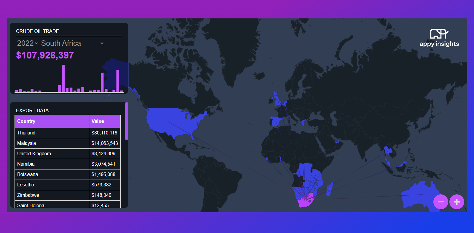
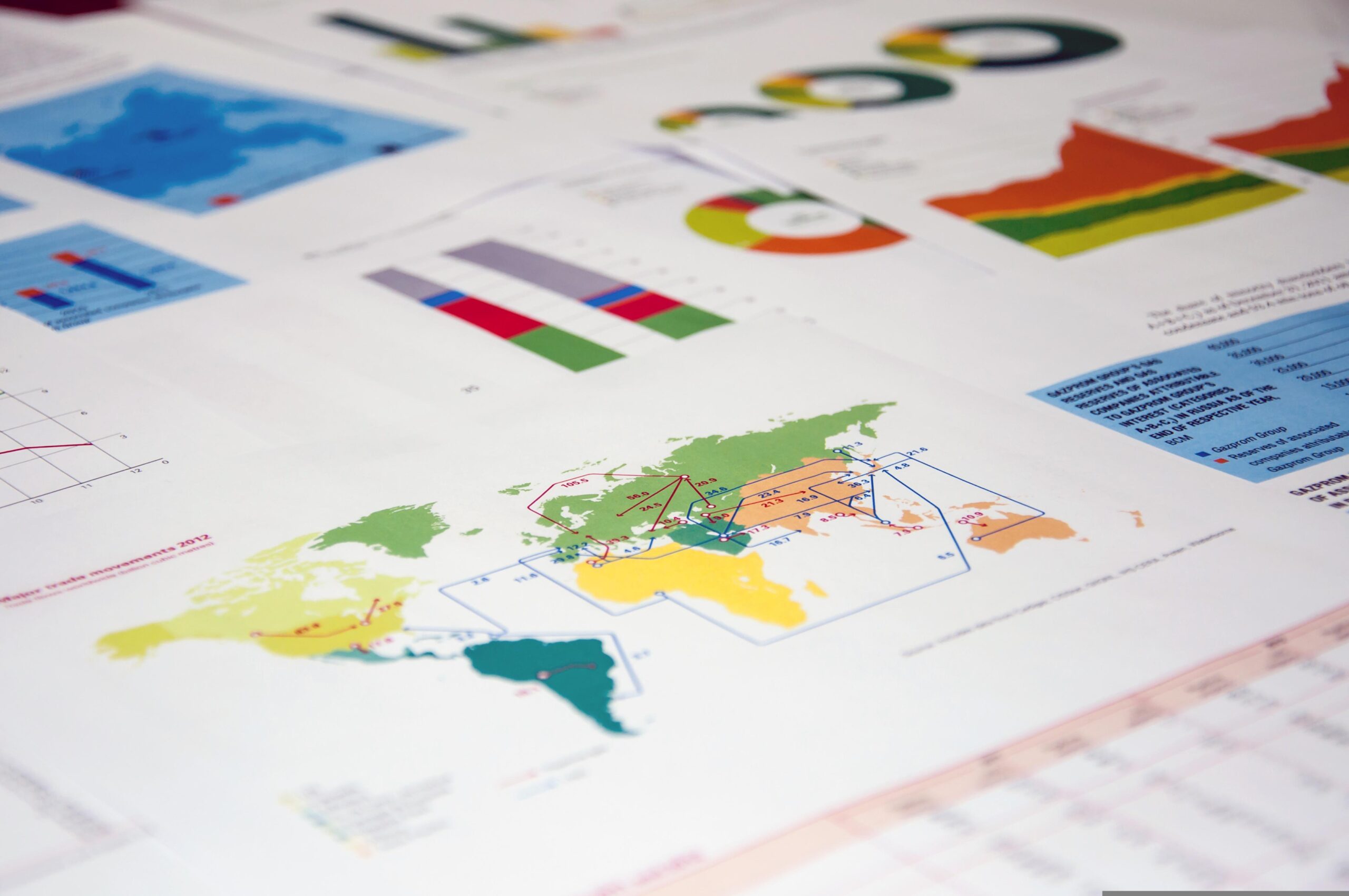
World map visualisation: Crude Oil Trade
This interactive world map visualisation was built from the ground up in order to showcase the exports and imports of crude oil across the globe AND cos we were looking for a cooler way to show global networking. Getting the data: The data behind the visualisation was retrieved from oec.world. The ETL pipeline was written…
-
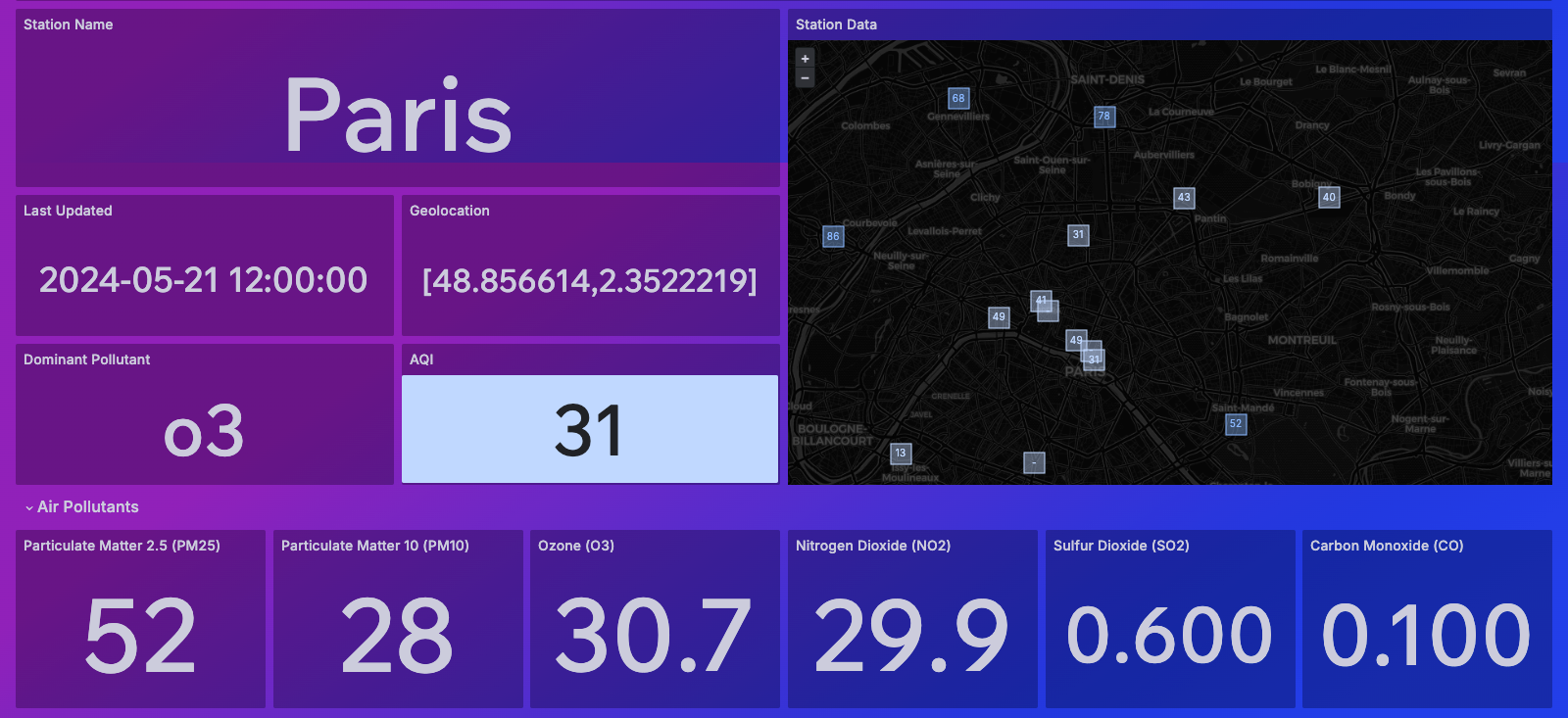
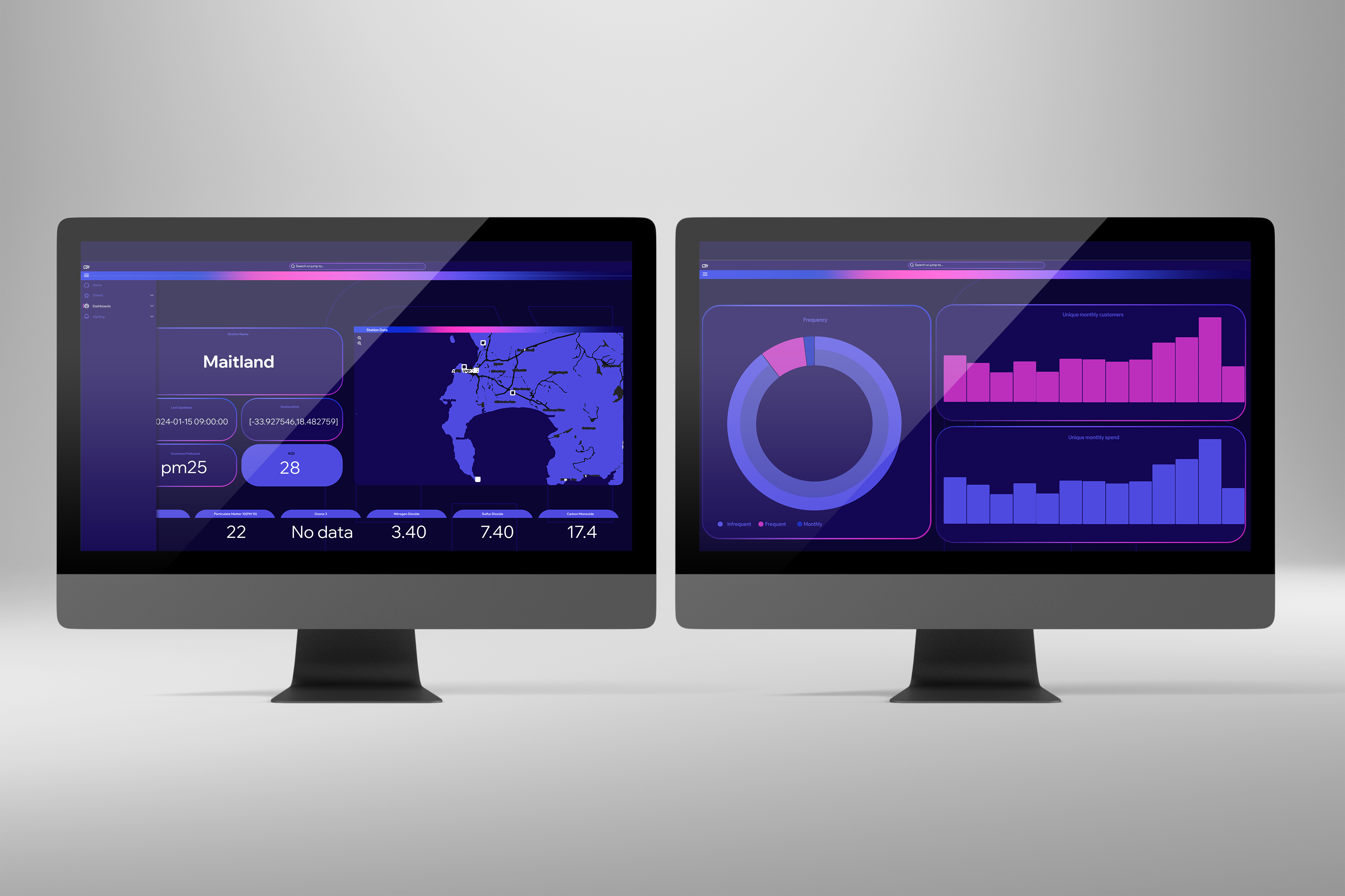
Understanding Air Quality
Enhancing Awareness and Insight through Innovative Dashboards – A Case Study Air quality stands at the forefront of global concerns, intertwined with the intricate web of climate change, public health, and environmental sustainability. At Appy Insights, we recognize the pivotal role of accessible data visualization in fostering understanding and action. That’s why we’ve developed dynamic…
-

Picking the right visualisation
—
When choosing the correct data visualisation, it is important to consider the data you have, the stakeholders that will be consuming the data and the message the data needs to convey. General guidelines for choosing the right visualisation are: 1) Understanding the data: Before a visualisation can be chosen it is important to…
-
5 Benefits of dashboards
—
1. Data visualisation: Dashboards provide a way to visually represent data using charts, graphs, and tables making it easy to understand as well as identify patterns, trends, and anomalies at a quick glance. 2. Real-time monitoring: Dashboards often represent data in real-time or near-real time making monitoring those KPI metrics more…
-
The difference between dashboards and reports
—
When it comes to representing data analysis for stakeholder consumption, one of two routes are usually considered, dashboards or reports. How do analysts know which one to use and when. This article will cover the differences between the two. What is a dashboard? A dashboard typically displays real-time or near real-time data which provides a…
-
The importance of visualising an organisation’s existing data for easier understanding and consumption
—
Data visualisation is the graphical representation of information and data. Using visual elements such as graphs, charts, and maps, data visualisation tools provide an easy-to-use way to see and understand trends, deviations, and patterns in data. The purpose of data visualisation is to make complex information more understandable, usable, and accessible. Many organisations may collect…