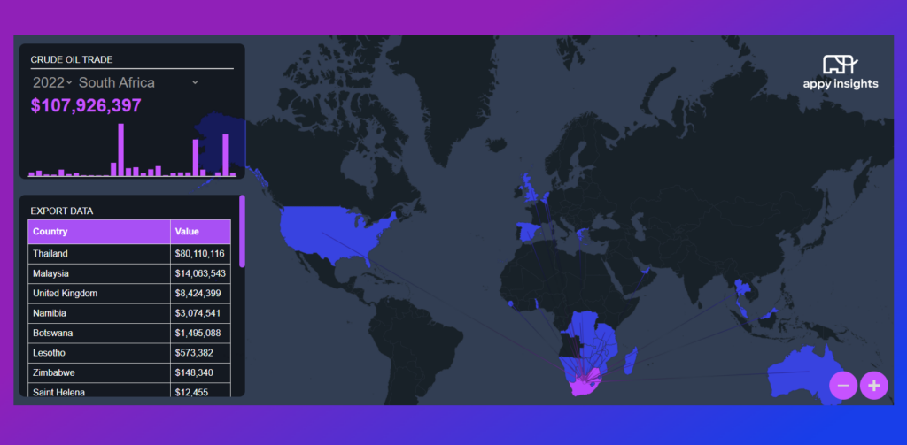
This interactive world map visualisation was built from the ground up in order to showcase the exports and imports of crude oil across the globe AND cos we were looking for a cooler way to show global networking.
Getting the data:
The data behind the visualisation was retrieved from oec.world. The ETL pipeline was written in python, hitting the various endpoints sequentially to retrieve the data as well as transform and map the data before inserting it into a database. Thereafter the data was transformed once more into a JSON format for consumption. We have decided to keep the database in a tabular format to use for further exploration, analysis and visualisation.
Developing the front end:
The front end was written in HTML, CSS and JavaScript. The first point of action was to embed the world map and make it interactive. This includes:
- Highlighting a country on hover
- Clicking to select a country
- Scroll to zoom
- Drag to move the map
A once off manual operation was required to identify and add in a single point to each country. This allowed us to dynamically create the lines showcasing which countries are being exported to. Thereafter, cards were added in to:
- Allow selection from the dropdowns
- Display the total value exported
- Graph showcasing the yearly trend of exports
- Export value broken down by country
Mapping and displaying the data:
Each country on the map has a unique code that matches to a datapoint the visualisation then gets dynamically populated based on the selection made on the map or drop downs. The data is stored in a nested JSON array which allows for easy traversing of the data and making the application work near instantaneously.
Interactive map:
Click the map below to experience it for yourself.


