When choosing the correct data visualisation, it is important to consider the data you have, the stakeholders that will be consuming the data and the message the data needs to convey. General guidelines for choosing the right visualisation are:
1) Understanding the data:
Before a visualisation can be chosen it is important to understand the data. A couple of good questions to ask are the data numerical categorical or time series in nature are there any trends or patterns that would be good to highlight.
2) Identify the messaging:
It is important to identify the key message that needs to be conveyed that’s helping to choose a visualisation effectively.
3) Account for the audience:
choosing A visualisation can also depend on the audience. Different audiences may have different levels of expertise or ranging from understanding basic graphs and charts to more complex graphs and charts.
4) Choosing the right chart:
Now it’s time to choose the right chart. some common chart types include:
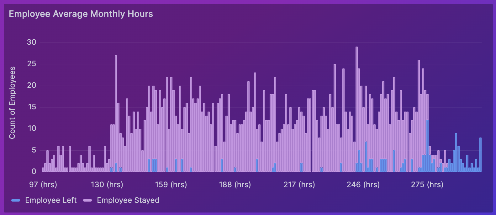
– Bar chart: this is generally suitable for comparing categorical data.

– Line chart: great for showing trends over time.

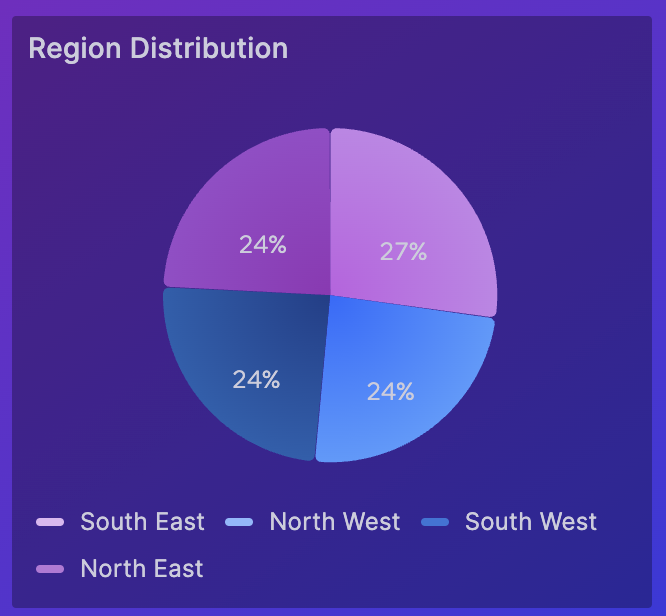
– Pie chart: shows a part of a whole.

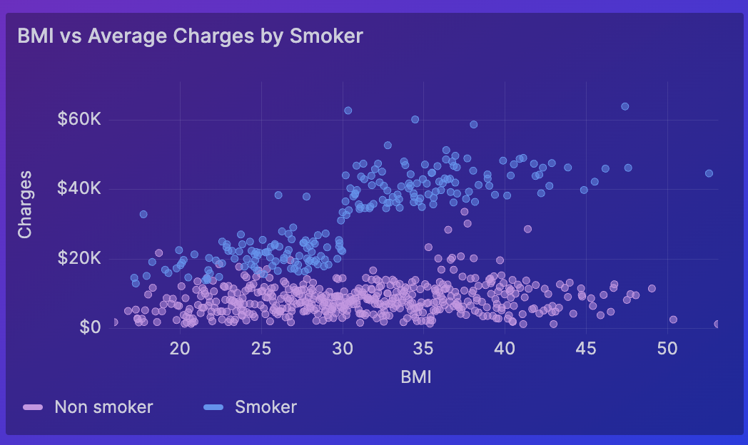
– Scatter plot: visualises the relationships between 2 variables.

– Histogram: displays the distribution of numerical data.

5) Colours and styling:
Use a set colour scheme to emphasise key points within the visualisations and do not use too many colours to avoid making the visualisation cluttered and hard to read
6) Keep it simple:
Always try to keep it simple and choose simple and clear visualisations that effectively communicate your message and avoid distractions.

