When it comes to representing data analysis for stakeholder consumption, one of two routes are usually considered, dashboards or reports. How do analysts know which one to use and when. This article will cover the differences between the two.
What is a dashboard?
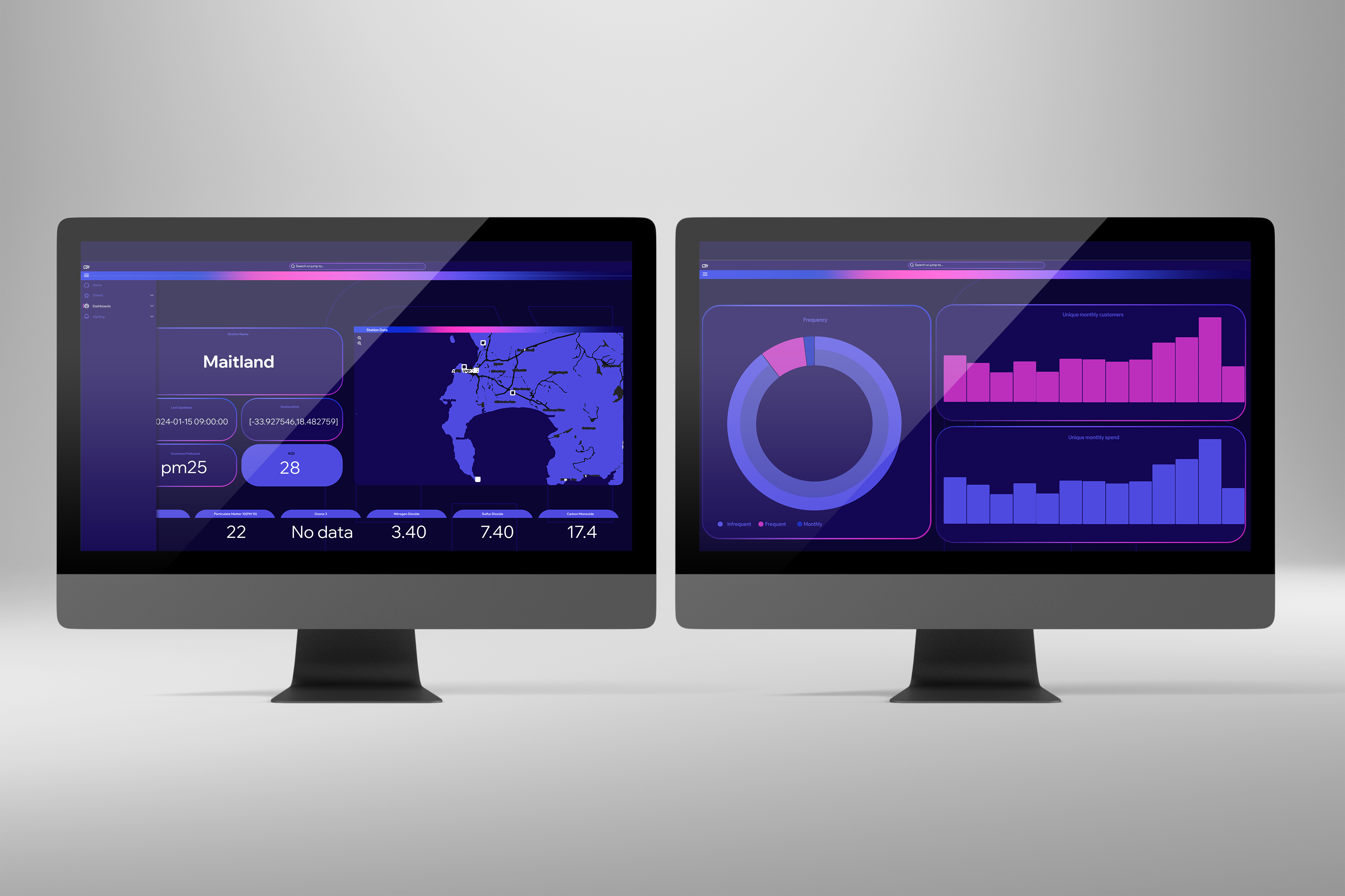
A dashboard typically displays real-time or near real-time data which provides a snapshot of how the current metrics that are being tracked are performing. Dashboards also make use of charts, graphs and other visual elements that allow stakeholders to understand the data in a quick and easy manner. These metrics are often interactive and support drill down features using filters to gain a deeper understanding. Dashboards also tend to focus on key performance indicator (KPI) monitoring which are the most critical for decision making. In the end dashboards are used for monitoring trends in real-time.

What is a report?
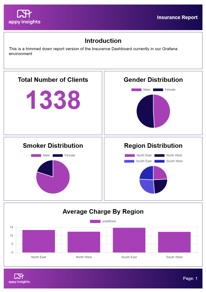
Reports are generally static in nature and focus on a specific historical period, for example yearly, quarterly, and monthly. These reports have a pre-defined structure, format and layout which provides more in-depth and detailed analysis. Reports tend to be less interactive compared to dashboards as they stick to a predefined structure without any drill down and filtering features. Reports provide stakeholders with an in-depth analysis which include explanations, recommendations, and interpretations. Reports can include visualisations such as tables, charts, and more detailed descriptions to assist in decision making and planning.

To conclude, the main disparity between dashboards and reports is that one is dynamic, and one is static. Dashboards also provide a quick overview of what is currently happening, and reports provide a more in-depth analysis.

