-
Crime Stats SA
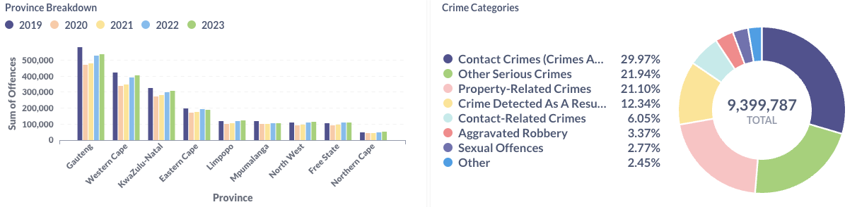
The South African Police Service (SAPS) collates a crime statistics report once every quarter of the fiscal year. The report and data are stored in a downloadable excel file for the end user to view and investigate as shown in the image below. The data compares the past 5 quarters to each other grouped by […]
-
Eskom Se Push
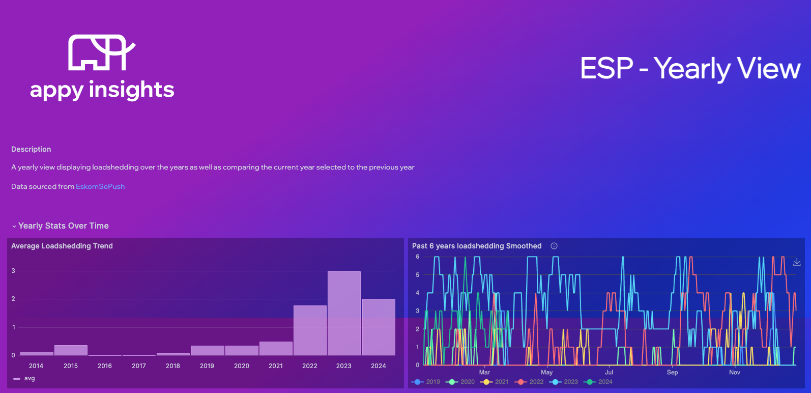
Eskom se Push stores and updates a Google Sheet with the national load shedding level and timestamp. This dataset has only 2 columns namely “created_at” and “stage”. We used this data to create a dashboard visualising the historical load shedding for the country. The goal was to extract as much value out of a simple […]
-
Shedding Light on Energy
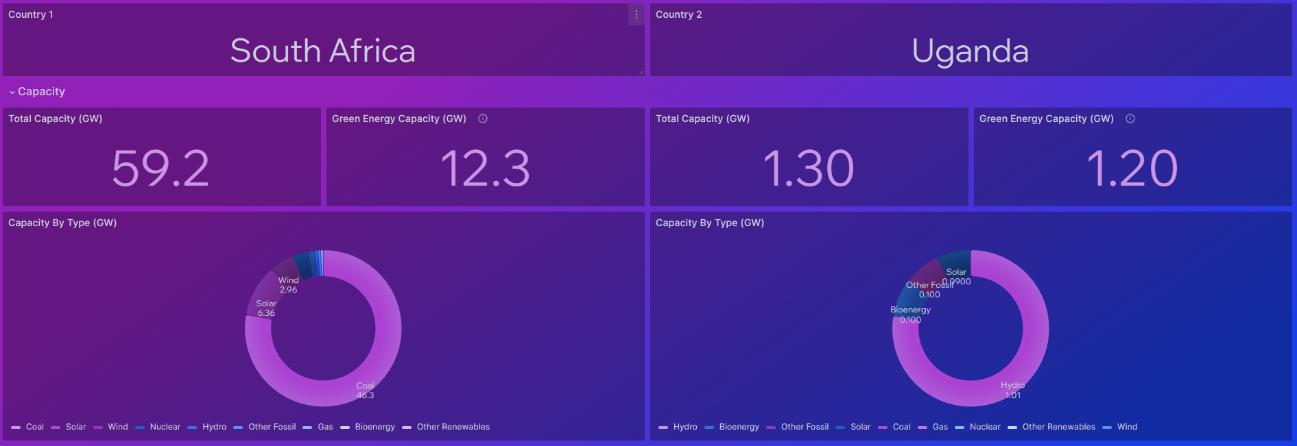
In South Africa, energy production has long been a topic of concern, especially with the recurring issue of load shedding. Faced with this challenge, we embarked on a journey to better understand and visualise energy dynamics, leading to the creation of a comprehensive data dashboard. This article delves into the genesis of our Power Compare […]
-
Understanding Air Quality
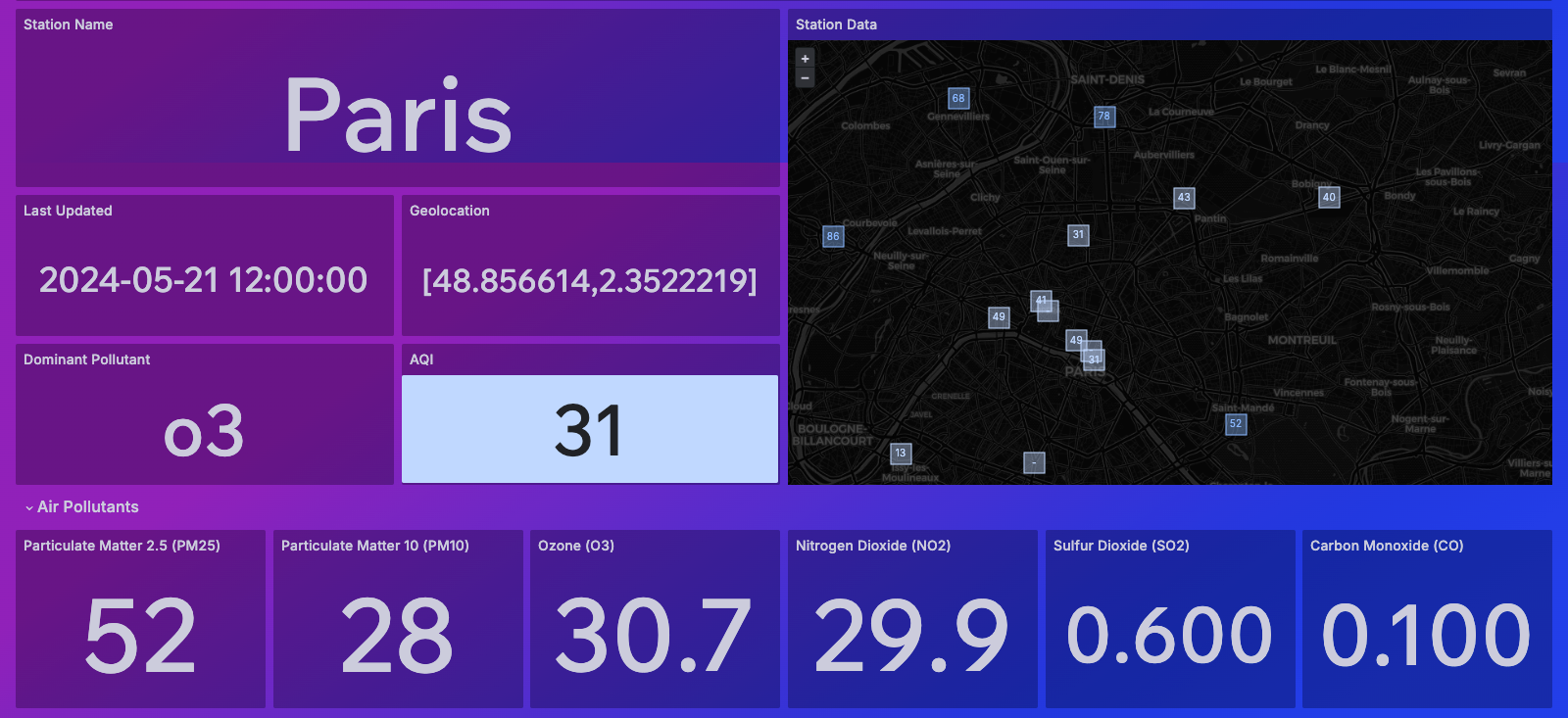
Enhancing Awareness and Insight through Innovative Dashboards – A Case Study Air quality stands at the forefront of global concerns, intertwined with the intricate web of climate change, public health, and environmental sustainability. At Appy Insights, we recognize the pivotal role of accessible data visualization in fostering understanding and action. That’s why we’ve developed dynamic […]
-
World map visualisation: Crude Oil Trade
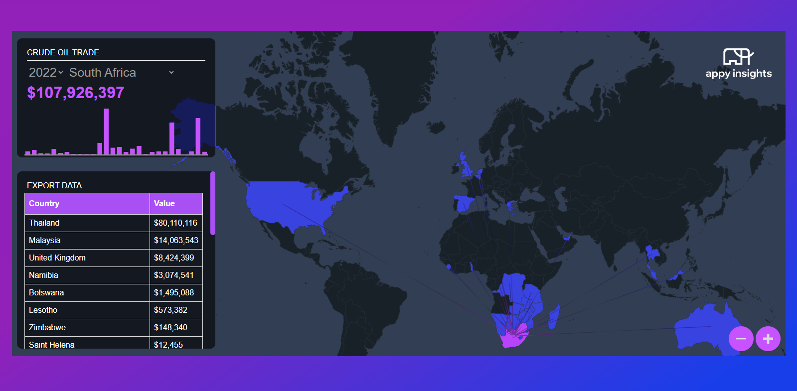
This interactive world map visualisation was built from the ground up in order to showcase the exports and imports of crude oil across the globe AND cos we were looking for a cooler way to show global networking. Getting the data: The data behind the visualisation was retrieved from oec.world. The ETL pipeline was written […]