The South African Police Service (SAPS) collates a crime statistics report once every quarter of the fiscal year. The report and data are stored in a downloadable excel file for the end user to view and investigate as shown in the image below. The data compares the past 5 quarters to each other grouped by the various crime categories. The sheet also provides a drill down on the province level. While this is sufficient if you are looking for a single figure it does not provide the granularity we’re looking for, nor does it have any visualisations for easy identification of trends and patterns.

Our goal was simple: Use the raw data to create an interactive dashboard to identify any trends and find possible use cases for the project.
Before we could achieve this goal, we needed to access and analyse the raw data. This proved to be quite challenging as the raw data was stored in the excel workbook and required a ton of manual cleaning before it could be ingested into a database.
The process we followed:
Analysis:
Upon analysing the raw we found that the data structure was not ideal for immediate ingestion. The data was grouped on multiple levels in the same sheet essentially creating unnecessary duplication of crime category groupings. It was then duplicated again for the roll up to the province level. The number of crimes for each month was in a new column which would make it inefficient to do queries using SQL.
Cleaning:
We identified the main categories and removed all duplicates that had any rolled-up figure so that the data was only on a station level with its respective main category and the group it would belong to. We removed any columns that were deemed non-essential to the goal at hand. Lastly, we pivoted the data to achieve a normalised dataset that could be queried efficiently.
Ingestion:
We created a database in a PostgreSQL database server and did a bulk insert. The raw data is finally ready to be visualised.
Extending the data:
We wanted to add some additional value to the data in the form of geo location to afford us the opportunity to include a nifty map functionality. To achieve this, we wrote a python script to scrape the latitude and longitude of all the SAPS stations across the country and store that in a reference table. We then got province population data from the world bank to further extend the dataset.
Visualisation:
All that is left to do is create visualisations. We created 3 dashboards discussed in detail below.
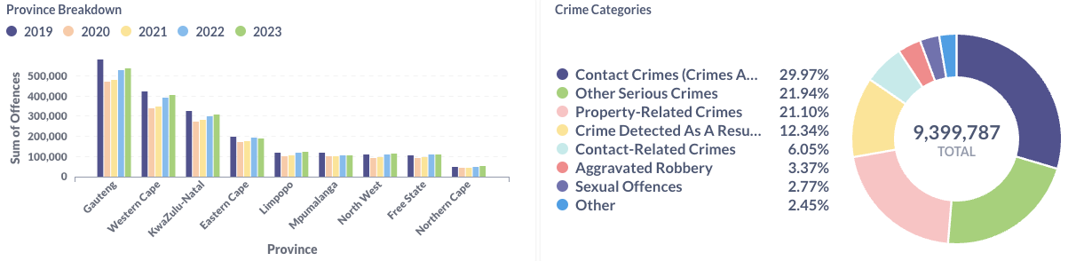
Crime Stats SA – Overview:
The overview looks at the crime stats for the past 5 years on a high level. It compares each year broken down by month and province. Some quick insights that can be drawn from this are:
- Crime dropped substantially during covid and has been on an incline ever since then.
- In April 2020 crime dropped by nearly 50% from the general 165 000 crimes to 85 000 during the hard lockdown.
- Gauteng province has the highest crime levels in the country.
- Property related crimes accounted for 21.10% of the crimes over the 5 years.
If you would like to see this dashboard in action head to: Crime Stats SA – Overview Dashboard
Crime Stats SA – Crimes:
The crimes dashboard is designed to provide detailed crime information on the most granular level for any area within the country. In this example we are looking at aggravated robbery for December 2023 in the Western Cape. We can see that there are 591 counts of aggravated robbery in the province with carjacking being the majority at 280 counts which equates to 47.38% of the total count. The map provides detailed information for all the reports at that location.
If you would like to see this dashboard in action head to: Crime Stats SA – Crimes Dashboard
Crime Stats SA – Population:
The final dashboard we developed was for population. Comparing the crimes committed to the population. In the example we are looking at crimes detected by police action, more specifically driving under the influence for the year 2023. We can see the number of offences per capita and how many offences occur on average per day. By extending the data to include population information we have uncovered that a potential reason for Gauteng having a higher crime rate could be due to them having the highest population in the smallest province.
If you would like to see this dashboard in action head to: Crime Stats – Population Dashboard
Use Case:

A potential use case for this data and visualisation is for individuals looking to buy a property in a particular area. If we head back to the crimes dashboard, we can filter on the latest property related crimes and look at burglary at residential premises for the Western Cape. A user can hover on the different stations to a detailed view on the number of offences reported for burglaries.