Eskom se Push stores and updates a Google Sheet with the national load shedding level and timestamp. This dataset has only 2 columns namely “created_at” and “stage”. We used this data to create a dashboard visualising the historical load shedding for the country. The goal was to extract as much value out of a simple 2 column dataset. And to showcase to prospective clients how even seemingly the most basic of data sources can produce insights and sexy visualisations.
Here is how we did it.
Steps involved:
1) Fetching the data
2) Ingesting the data
3) Visualisation
Step 1 – Fetching the data:
To continuously stay up to data we used a python script to fetch the data directly from the google sheet on a daily basis.
Step 2 – Ingestion:
A postgreSQL database was created with the appropriate schema to house the data. The scheduled python script then generates unique keys for each record and only insert the records that are new. This takes care of data redundancy. This step is crucial to maintain data persistence as well as making the data easy to query and manipulate for the various visualisations in the next step.
Step 3 – Visualisation:
A preliminary analysis of the data was done to determine which visualisations could be used to tell the South African load shedding story.
We have derived 2 dashboards one looking at loadshedding on yearly level and the other looking at loadshedding on a monthly level.
Monthly level:
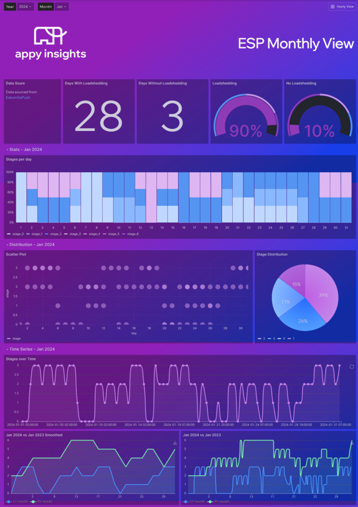
The monthly level has visualisation for how many days of the month we had loadshedding and how many days we did not have load shedding. It also has a breakdown of the different stages that happened in a given day for the month. A scatter plot showcasing a return to a level denoted by the darker shades. A distribution of the stages for that month. A line chart showcasing the change in stages over time. And then a comparison to last year for the same month.

Yearly level:
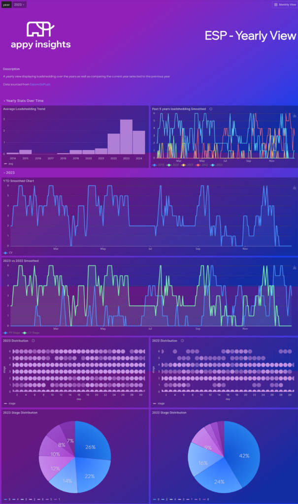
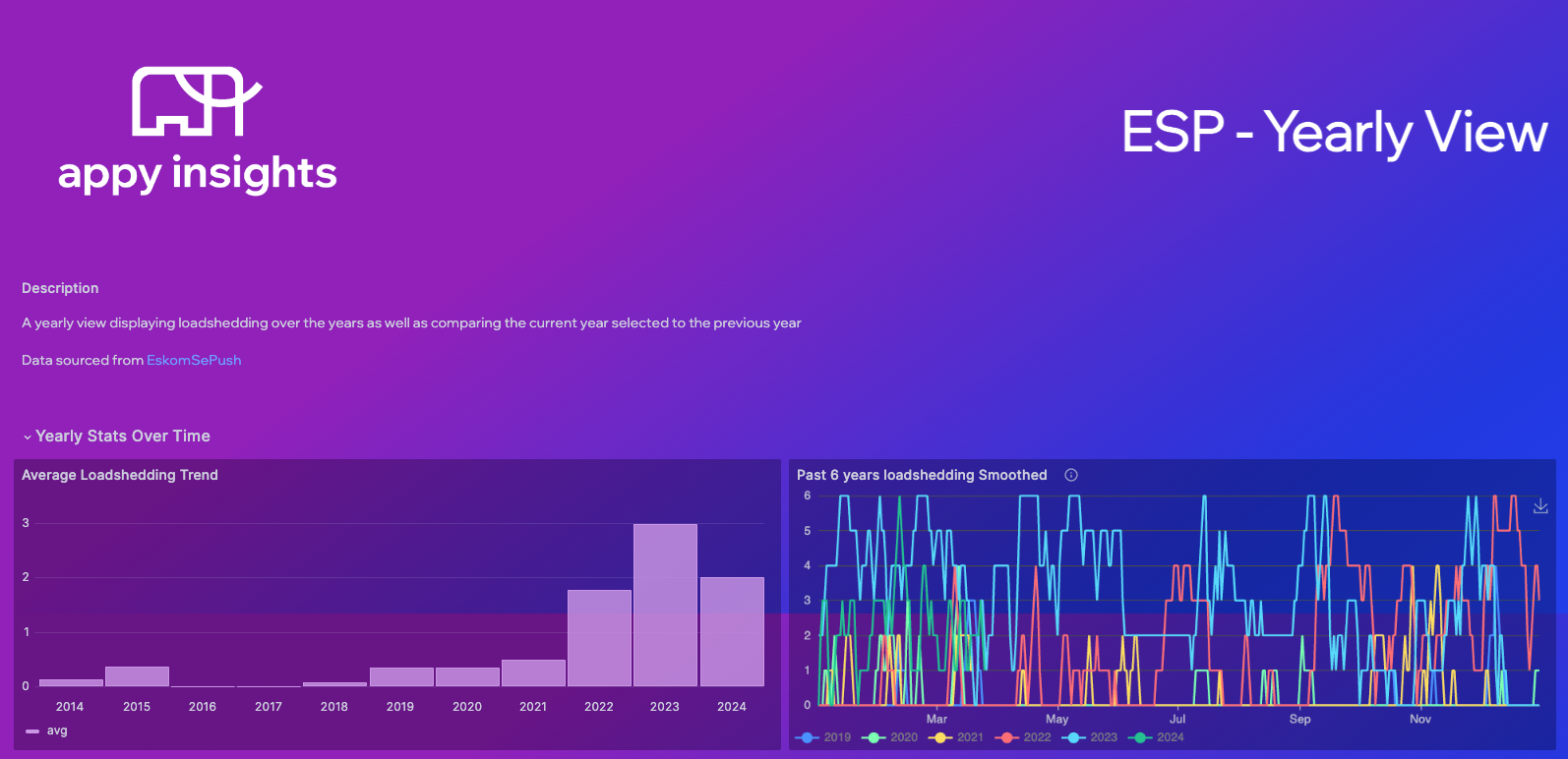
The yearly level looks at the loadshedding trend over time 2023 being the worst year for load shedding. Furthermore, it compares the past 5 years of load shedding for through the year. We can also see the trend for the year and compare that to the previous year. We have the distributions as well where the darker shades occur more frequently for that specific day of the month and stage. Lastly, we visualise the distribution of stages as a percentage in a pie chart.


