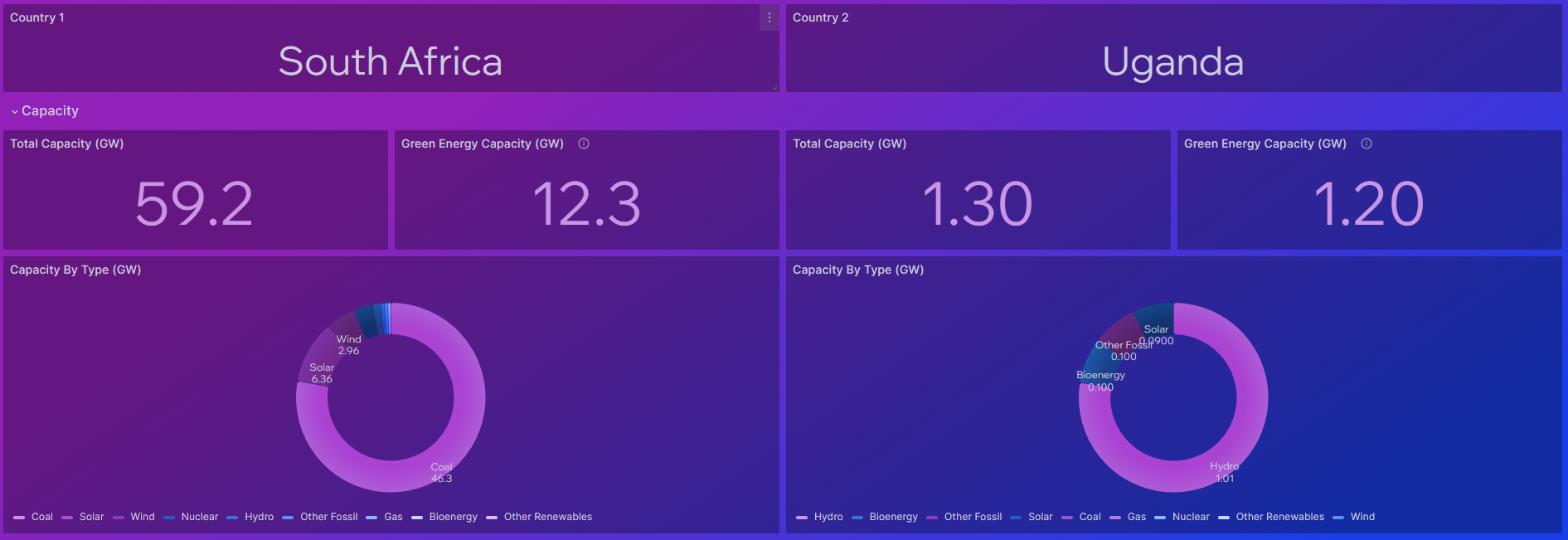
In South Africa, energy production has long been a topic of concern, especially with the recurring issue of load shedding. Faced with this challenge, we embarked on a journey to better understand and visualise energy dynamics, leading to the creation of a comprehensive data dashboard. This article delves into the genesis of our Power Compare dashboard and its evolution into a powerful tool for analysing energy consumption, demand, and production on a global scale.
The Spark of Inspiration
Our quest for accurate and comprehensive energy data led me to Ember Climate, a reliable source for monthly and yearly datasets on energy production, demand, and consumption across the globe. This discovery laid the foundation for what would become a transformative project. As we delved deeper into the world of energy data, it became evident that to gain a holistic understanding, we needed to contextualise the numbers. This led us to explore additional indicators such as population count, GDP and access to electricity, crucial factors that influence energy dynamics. Leveraging the World Bank API, we were able to seamlessly integrate these variables into our dashboard, enriching the analysis and providing valuable insights.
Sources: Ember Climate | World Bank API
Building the Dashboard
The inception of our data dashboard was rooted in the need for a comprehensive view of energy dynamics within a single country. Initially, the dashboard took shape as a singular view, meticulously crafted to display a plethora of data points encompassing energy production, demand, and consumption for a chosen nation. This initial iteration served as the foundation, providing valuable insights into the intricate nuances of energy usage within a specific context.
However, as our understanding deepened and the scope of our ambition expanded, it became evident that the true power of data lies in comparison. Recognizing the value of benchmarking against global standards and best practices, we embarked on a journey to transform our dashboard into a comparative tool.

The evolution began with a simple yet pivotal enhancement – the introduction of comparative analysis capabilities. This marked a significant shift in the dashboard’s functionality, as users now had the ability to select and compare the energy profiles of two countries side by side. This transformative feature unlocked a world of possibilities, enabling users to gain deeper insights by juxtaposing the energy dynamics of different nations. Central to this enhancement was the integration of intuitive filtering mechanisms, designed to streamline the comparative analysis process. Through dropdown filters, users could seamlessly select their desired countries and explore a wide range of aggregates for a specific year. This intuitive interface not only simplified the user experience but also empowered users to tailor their analysis to suit their unique requirements.
Sneak Peak
Looking Ahead
As we reflect on the journey that led to the creation of our data dashboard, we are reminded of the endless possibilities that lie ahead. The quest for sustainable energy solutions continues, and data will remain our most potent tool in this endeavour. We are committed to further enhancing the dashboard, incorporating new datasets, and embracing emerging technologies to stay at the forefront of energy analytics.

