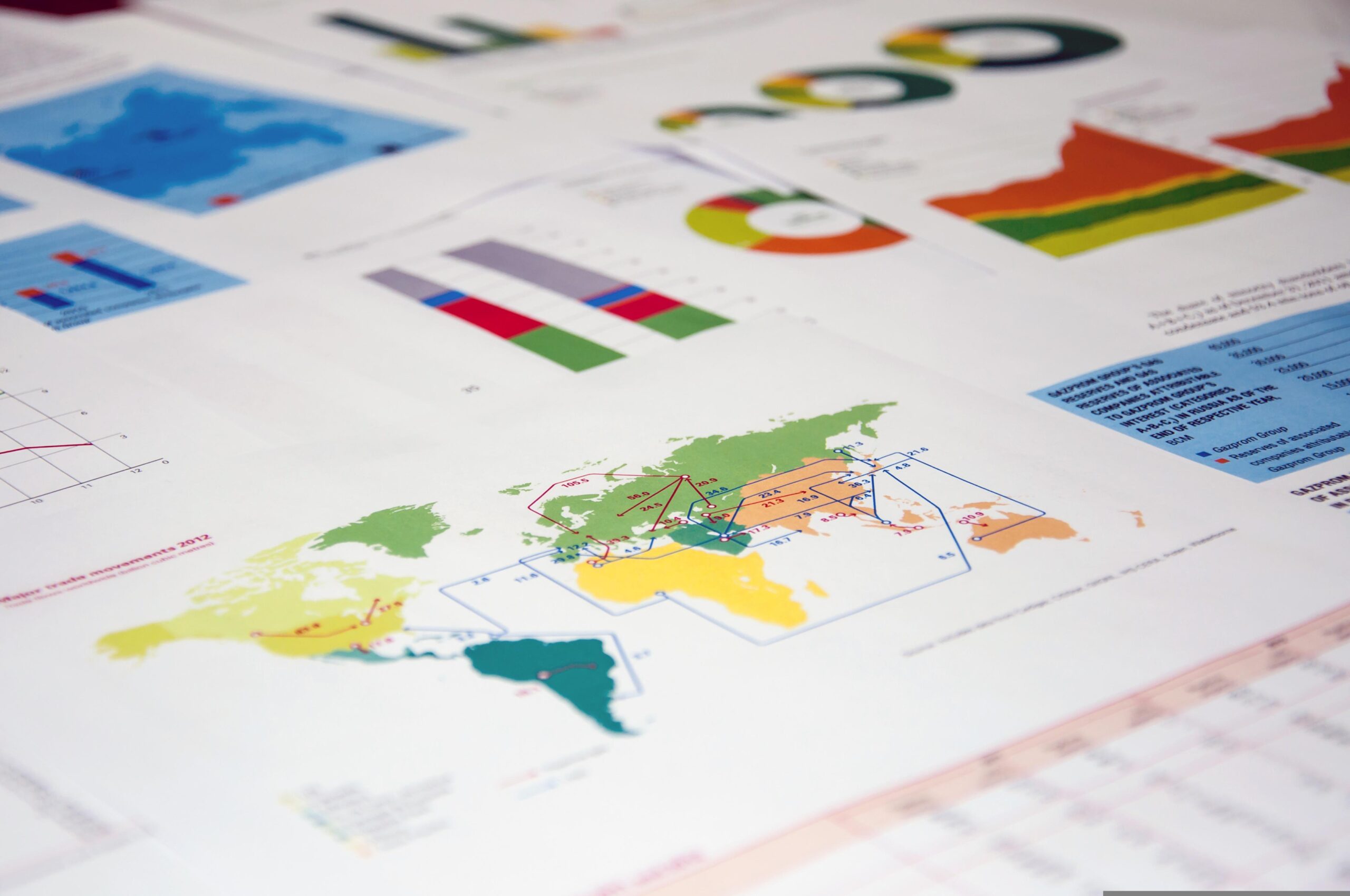
Data visualisation is the graphical representation of information and data. Using visual elements such as graphs, charts, and maps, data visualisation tools provide an easy-to-use way to see and understand trends, deviations, and patterns in data. The purpose of data visualisation is to make complex information more understandable, usable, and accessible.
Many organisations may collect and store various types of data over a long period of time all while not having any idea of the value this data can provide for the organisation. Data visualisations have many benefits and promote effective communication between teams and stakeholders in an organisation essentially assisting in breaking down the silos. Furthermore, facilitating transparency, collaboration and shared understanding of data which leads to an enhanced and unified decision-making process.
Here are some of the benefits of data visualisation:
1. Simplifies complex data.
Large and interconnected complex datasets can be broken down and consumed visually for key stakeholders to digest in an easy and accessible manner.
2. Revealing patterns and trends.
Various visualisation formats such as charts and graphs can be used to uncover patterns, correlations and trends that may not be noticeable in the raw data format. This would lead to faster decision-making saving both time and resources.
3. Increasing accessibility.
Visualising data makes it more accessible to a wider audience over and above individuals who are data experts.
4. Identifying areas that require attention.
By drawing visualisations from raw data organisations can identify areas that require improvement and allocate the necessary resources to improve those areas.
5. Increasing productivity
Having access to insights that are visually represented, teams and stakeholders can act quickly thus enhancing an organisation’s productivity.
These points highlight the benefits of visually representing an organisation’s existing data to draw insights which would in turn be used to add value to both in the short and long term for the organisation. Uncovering insights that would otherwise be unknown.
While there may be many benefits to visualising existing data it is also beneficial to understand the cons of data visualisation which may not be immediately apparent.
1. Data could be biassed.
The data collected could be biassed towards a certain group or outcome thus resulting in incorrect information being relayed to stakeholders.
2. Correlation does not always mean causation.
Just because variables may correlate visually does not always mean that one always affects the other. It could be an anomaly.
By being aware of these intricacies relating to data visualisation. Organisations should always scrutinise any uncertain patterns before drawing conclusions.